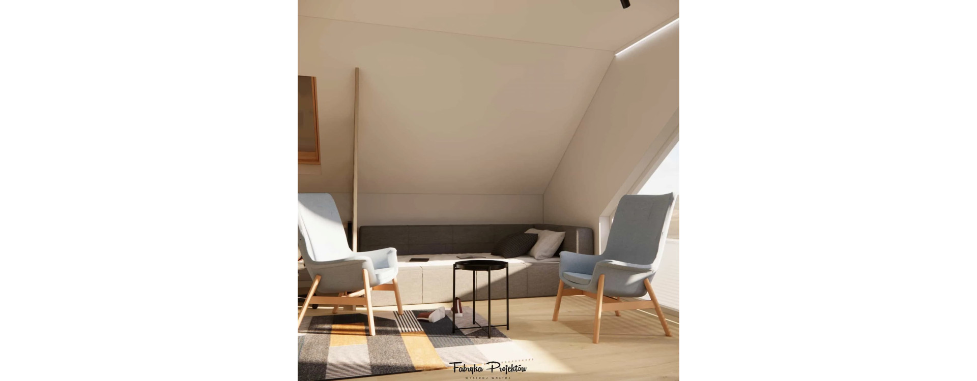
A 24m2 attic room design for an 11-year-old boy that combines a study zone, relaxation area and storage. The modern sloped-ceiling layout with a corner desk, comfortable lounge space and custom-built cabinetry creates a functional and comfortable interior that grows with the child.
Introduction
Designing a children's room in the attic is always a challenge – especially when we combine functionality, ergonomics, comfort and aesthetics tailored to the user’s age in one interior. In the case of this 24m2 room for an 11–year-old, our task was to create a space that would evolve harmoniously as the child grows and at the same time remain modern, practical and visually refined.
The sloped ceilings, roof window, large glazing and irregular attic geometry allowed us to build an interior full of light and dynamics, while carefully selected materials and custom solutions made it possible to design a room that combines three main zones: a relaxation area, a desk and study zone, and a storage and entertainment zone. This interior is an example of how a modern arrangement can be functional, warm and suited to the needs of a young user at the same time.
Room analysis and design assumptions
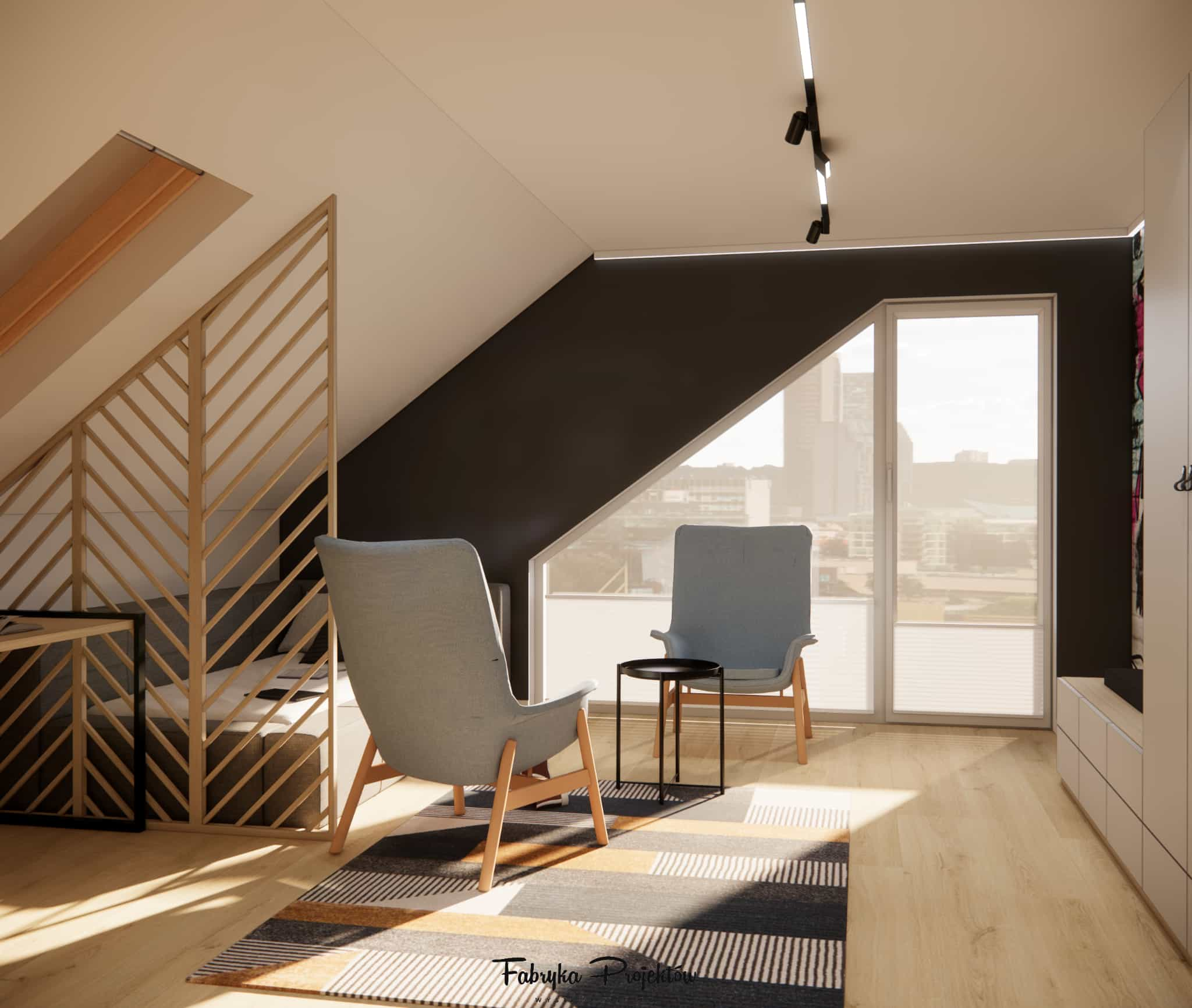
The 24m2 room is located in the attic with sloped ceilings of varying height. Every corner of the room had to be carefully considered in terms of ergonomics to make full use of the available space.
Main design challenges:
- sloped ceilings limiting full height along the side walls,
- a large balcony glazing that required a thoughtful layout of the relaxation zone,
- a roof window influencing the position of the desk and access to natural light,
- the need to design spacious storage in the form of a wardrobe and bookcases without overwhelming the room,
- the need to create a relaxation zone balancing the dynamic character of the study area.
Our goal was to create an elastic, bright and modern interior that supports both rest and learning, as well as the development of hobbies.
Relaxation zone – two armchairs, coffee table and city view
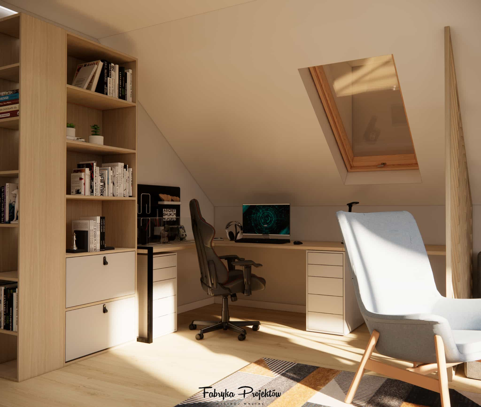
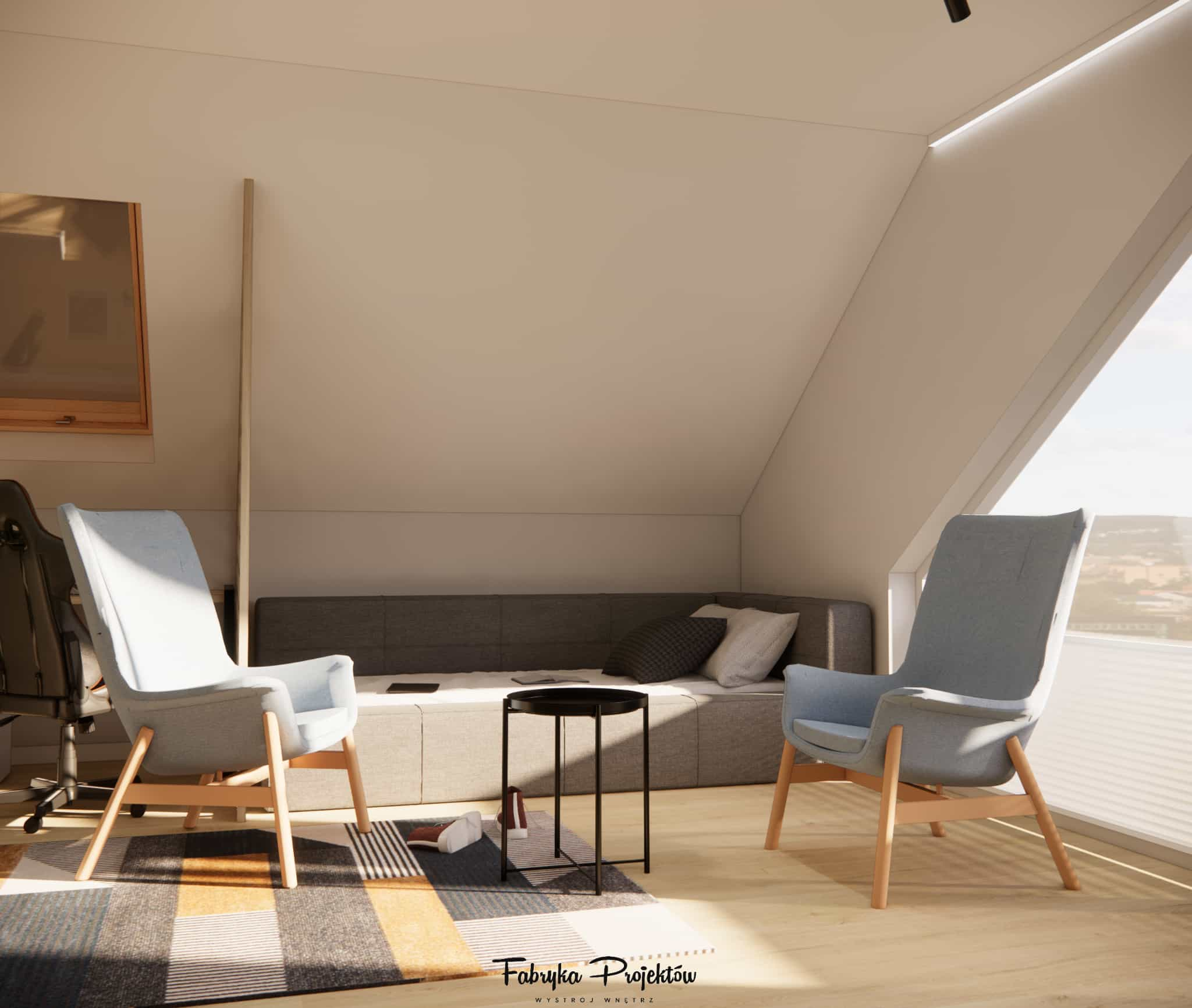
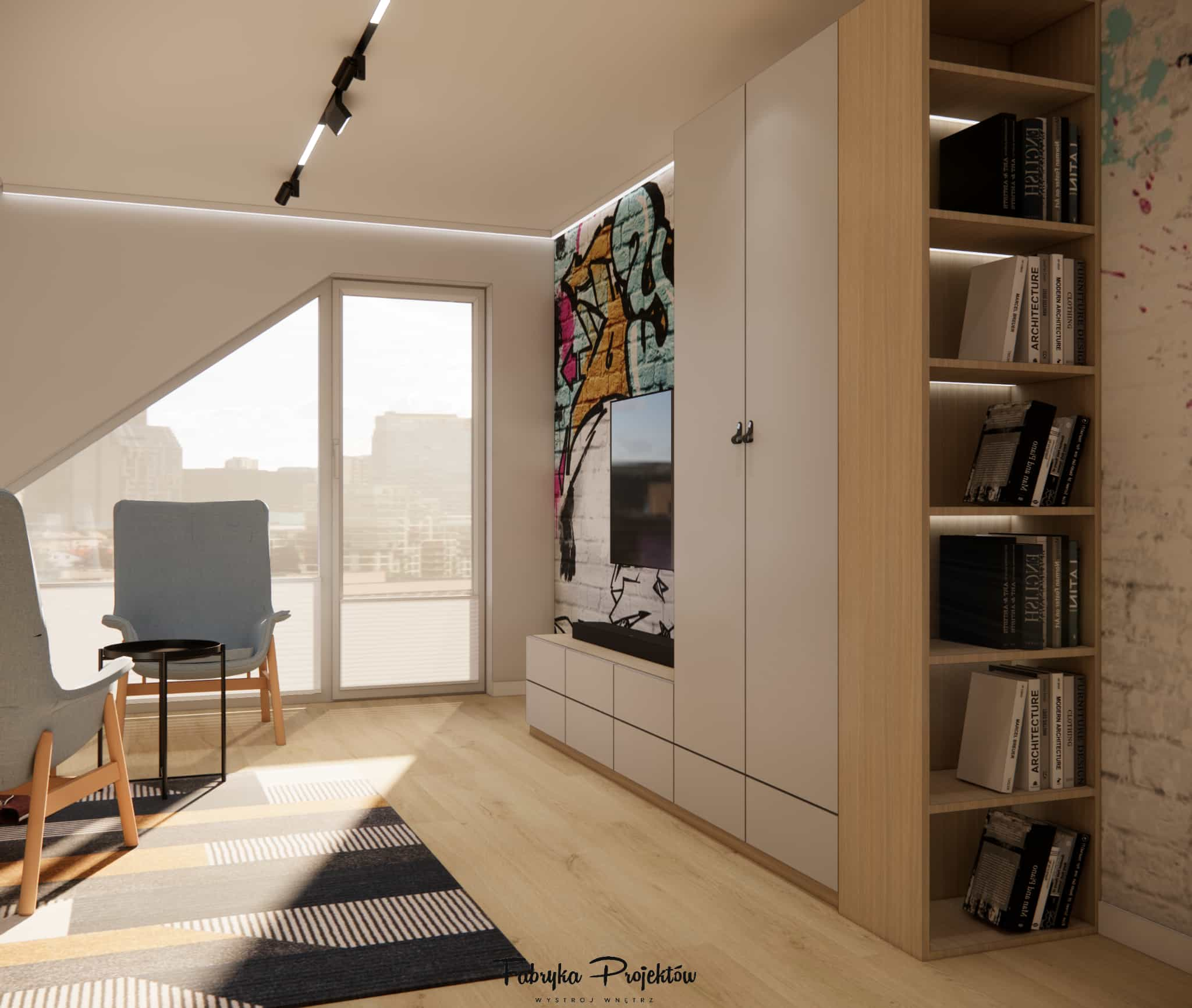
The most representative part of the interior is the area next to the large window. Two comfortable armchairs in a light blue colour placed on a geometric rug create a space for conversations, reading and relaxation.
Why two armchairs? We wanted the 11-year-old to have a space not only for himself, but also for a parent, friend or sibling. It is a zone for shared relaxation, board games or simply a quiet moment.
The armchairs, made of light fabric on wooden legs, introduce softness and natural warmth. The light coming through the large window highlights the entire lounge corner, making this part of the room bright and pleasant throughout the day.
Study zone and desk – ergonomics in the form of a corner layout
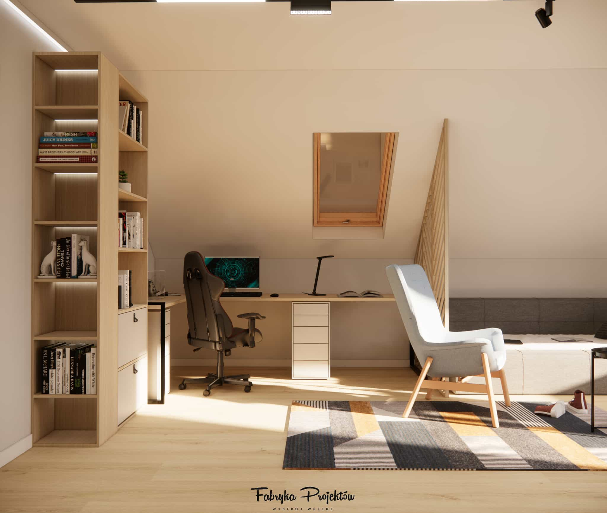
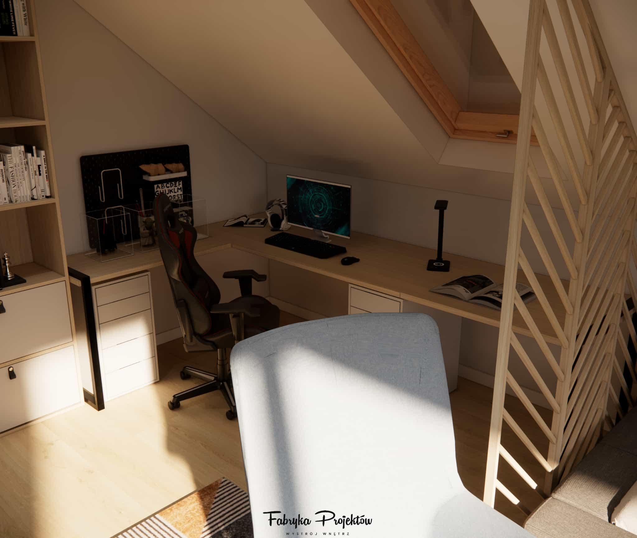
The other part of the room is occupied by a large corner desk made to measure from light wood. The desk fits perfectly under the slope, providing a full-size space for studying, working at the computer and developing hobbies.
Key features of the study zone:
- an ergonomic gaming chair providing comfort during long sitting sessions,
- a wide worktop that easily accommodates a computer, books and accessories,
- spacious drawers under the desk,
- a roof window above the desk bringing daylight directly onto the work surface,
- task lighting in the form of a modern LED lamp.
The desk zone has been designed to “grow” with the user — offering space both for play and serious study.
Sleeping zone – comfortable bed under the slope
Along the sloped wall there is a comfortable low-platform bed. Its minimalist form works perfectly with the room geometry, while soft cushions add cosiness.
The bed has a neutral colour palette — greys and warm beige — making it suitable for the interior at every stage of the child’s growth.
Custom-built storage with wardrobe and bookcase
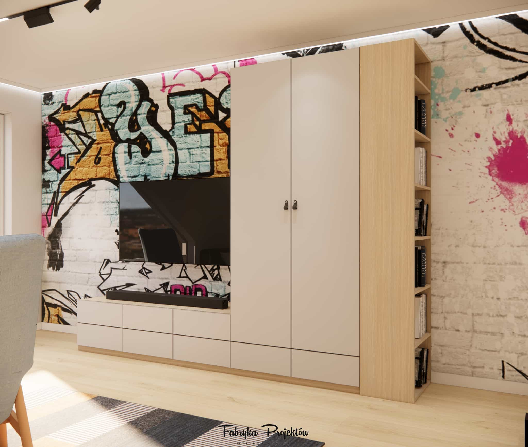
Along one of the walls we designed a tall wardrobe combined with a bookcase and lower cabinets. The combination of light wood and white fronts ensures the built-in furniture does not overwhelm the space despite its high storage capacity.
The element that gives the room its character is the graffiti wall, perfectly suited to the age and energy of the young user. It is a feature that adds individuality but doesn’t dominate thanks to the neutral tones of the remaining décor.
The entire composition is illuminated by a subtle LED strip hidden near the ceiling – modern, practical and visually striking.
Decorative partition following the slope – wood and geometry
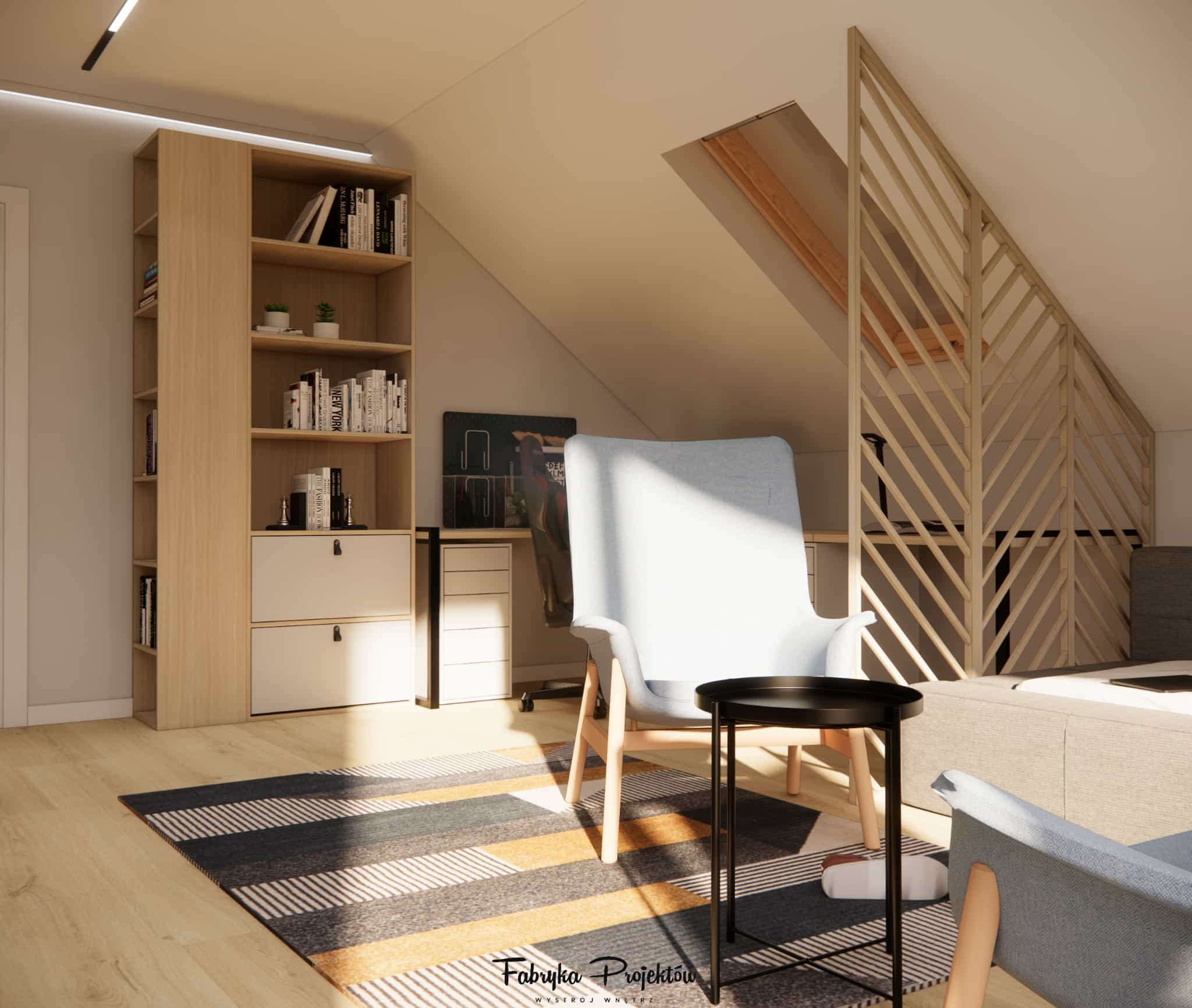
One of the signature elements of the design is a wooden openwork partition in a herringbone pattern that subtly separates the lounge zone from the desk area. It adds lightness to the interior and introduces a natural texture.
Materials used in the arrangement
- Flooring: light wood with natural grain that warms up the space.
- Armchairs: textured fabric in a light blue shade with beech wooden legs.
- Built-in cabinetry: laminated board in light oak colour with white matt fronts.
- Desk: wood-effect laminate matched to the cabinetry.
- TV wall: graffiti wallpaper resistant to staining.
- Lighting: linear LED along the ceiling, modern spots and task lamp.
- Rug: geometric pattern in shades of grey, black, yellow and beige.
Functional zones in the room
Each zone has been designed to be maximally practical and adjusted to the possibilities of an attic layout.
- Relaxation zone – armchairs + coffee table
- TV zone – graffiti wall + cabinetry
- Sleeping zone – bed under the slope
- Study zone – corner desk + ergonomic chair
- Storage zone – spacious wardrobes and bookcases
- Creative zone – open floor area in the centre of the room
Designer’s comment
“In this project we wanted to create a room that would be full of energy, yet remain organised and harmonious. The sloped ceilings were not a limitation — they became an asset, shaping the unique geometry of the interior. We designed a space that encourages relaxation, supports learning and develops creativity. It is a room that will mature together with its young user.” — Fabryka Projektów Team
Summary
The 24m2 attic room for an 11-year-old is an example of how a well-thought-out layout, appropriate choice of materials and custom-made functional solutions can create a space that is perfect for a school-age child.
There is room here for studying, relaxing, hobbies, play and storage. Modern lighting, bright colours, calm wood tones and designer accents build an interior with character that does not overwhelm.
This is a project completed just the way we like it — aesthetically pleasing, functional and refined in every detail.
FAQ – frequently asked questions about an 11-year-old’s attic room
What is the best way to arrange furniture in an attic room?
We recommend placing the lowest elements (bed, low cabinets, horizontal bookcases) under the slopes and tall furniture along the full-height walls. The desk works best under the roof window — this provides excellent daylight.
Is a graffiti wallpaper not too “teenage”?
If the rest of the interior remains neutral — no. Such an accent adds individuality and can easily be changed later when the child grows up.
How to light a room with sloped ceilings?
The best solutions are LED strips along the room perimeter, spot lighting and task lamps at the desk. We avoid single hanging fixtures that could interfere with the slopes.
Is a corner desk better than a straight one?
Yes — especially in the attic. It makes better use of the space under the slope and offers a larger work surface.
How to organise storage in a child’s room?
The most practical is cabinetry combining a wardrobe, drawers and open shelves. This way everything has its place and it is easier to keep the room tidy.
Are two armchairs in a child’s room a good idea?
Absolutely — they support family interactions and provide a place for shared reading, conversations, board games or relaxing with a view.
Do sloped ceilings limit the room’s functionality?
No, if they are well used. Slopes add character, and a custom-made design allows them to become sleeping zones, storage or decorative elements.
Which colours work best in an attic space?
Light, neutral and brightening colours — beiges, off-whites, light greys. Strong accents (such as graffiti) add rhythm, but their proportion should be carefully controlled.